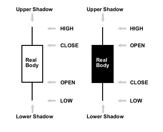
A: Well, you must have heard of the saying 'A picture tells a thousand words'? This has never been so true in the field of technical analysis and even more so in Japanese candlestick analysis. The fact is that a simple line chart usually shows the closing price for an instrument. A more powerful chart can be drawn using candlesticks which will show both open and closing price. The 'wicks' [also called shadows] also indicate the trading range. Unlike bar charts, candles are colour coded in a certain way depending on your charting software; a (white/blue/green) candle represents a higher closing relative to the opening of the particular period (an 'up' candle). A red or black candle represents a lower closing relative to the opening of a particular period (a 'down' candle).
 |
The top and bottom of each candlestick indicate the high and the low for the period in question, while the solid body represents the movement from the opening to the closing of that period, with red being a fall and green being an increase.
Candlestick Explanation: The 'real body' of the candlestick is formed by drawing the difference between the opening and closing prices for the period as a box. If the closing price is higher than the opening price, i.e. , if the share's price has increased for the period, the box is coloured white. If the opening price is higher than the closing price, that is, if the share's price decreased for the period, the box is coloured black. The term real body is generally abbreviated to just 'body'.
By making the definitions above, i.e., assigning alternating colours to up days and down days, we have in one clean sweap allowed ourselves to be able to very quickly identify whether bull or bears are in control of a share's price. Moreover, by defining shadows, we can identify areas of support and resistance.
How? To make up a white candle, the closing price for a period must be above the open price, which means the share had an up period. If we have an up period, logic implies that the buyers were more aggressive than the sellers during the set time-period. To generate a black candle, the closing price for a period must be below the opening price, which means the share had a down period. If we have a down period, it follows that the sellers were more aggressive than the buyers during the selected period.
|
|
Thus white candles equal buying aggression and black candles equal selling aggression. One of the most popular ways of using the candlestick chart is to identify a strong trend in the market. A line of candlesticks that move upwards from left to right with successive higher highs indicates a rising trend. Conversely, a line that moves downwards as it goes across the chart with a stream of lower lows marks a falling trend.
You may have heard the expression 'the trend is your friend'. This means that if a market is in a strong uptrend you're generally safe to bet on the assumption that prices will continue to rise. Conversely, if a market is in a strong down-trend that shows no sign of coming to an end, assuming that it will keep falling makes sense. In each scenario, we could reasonably expect the trend to continue until we see sufficient candles of another colour to alert us that the balance of power has shifted. Immediately, we should be thinking that candles can give us excellent continuation and reversal patterns.
 |
So do candlestick patterns work? In a nutshell candlestick patterns do work. But not in isolation and they do not work all of the time. I would never base my trading decision on just a candlestick formation, although it is always useful knowing what they are, as when certain patters occur around points of support/resistance it can give you a clue as to what is going on.
Certainly they not just 'mysticism'. They are footprints of price action, showing you where the price was during the time period in question. Also, inspecting a candlestick can get you a real sense of the fight going on between bulls and bears minute by minute.
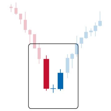
Seeing candlesticks constrict, getting smaller and smaller one after the other (inside bars), is a brilliant sign, as is the doji. You can almost guarantee that when the price breaks through one side or other of these candlesticks it will keep going for long enough to take a little profit.
So, in answer to your question...use of support and resistance lines with 'certain' (not all) candlestick patterns, I personally find them very useful.
Note: One thing people often fail to do with candles is wait for the confirmations. A doji star, for example, is an indication that the markets may turn. But don't go shorting it straight away. Wait for the confirmation, and ride the change in trend.
The content of this site is copyright 2016 Financial Spread Betting Ltd. Please contact us if you wish to reproduce any of it.