Turning Line
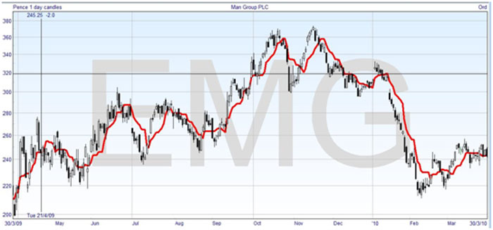
The Turning Line is similar to a moving average, but calculated a little differently. It’s sometimes also called the Conversion Line. It’s based on the last nine days. Instead of taking an average of the closing prices for each day, it’s just the midpoint between the highest high and the lowest low on any of those days. That is, it’s the middle of the whole trading range that happened in the last nine days. For the security shown above, here is the Turning Line which I have thickened up for clarity –

If you look back nine days from any point on the line, you will see the highest high and lowest low in that time, and that the Turning Line is in the middle. Sometimes it is horizontal, which is when the highest high or lowest low occurred less than nine days ago and generally it will appear a bit jerkier than a regular moving average.
Standard Line
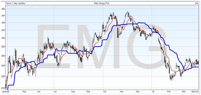
The Standard Line is also referred to as the Baseline. It’s calculated in the same way as the Turning Line, but over a period of the last 26 days. I’ve shown it in blue and thickened up in the chart below –

As with the Turning Line, if the highest high and lowest low are in the middle of the 26 day period, then you get a horizontal line, and it’s obviously much more likely with a longer time. This makes it appear much jerkier.
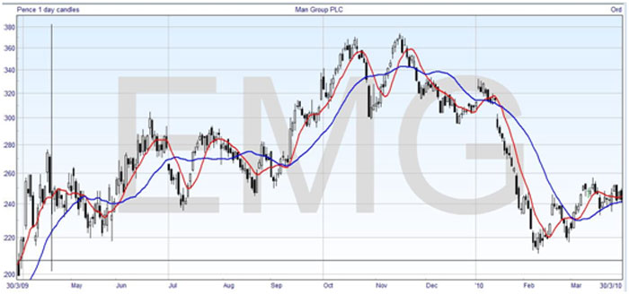
If you like, you can think of these lines as types of moving averages, and use them in a double crossover method, but that’s not their real purpose when you trade with cloud charts. They actually help in the construction of the cloud. Here’s the chart again, with Simple Moving Averages in the same time periods and colors, so that you can see the similarities –

But as I said, the moving averages tend to be much smoother.


Join the discussion