Charting Methods
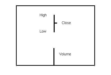
The bar chart has two elements: 1) the price bar, including high, low and closing price; and 2) the volume bar.

Most commonly, daily high, low, close and volume data are used to make bar charts. But any period may be used. Weekly or even monthly charts are often used for long-term analysis, while at the other extreme, intraday data for periods from minutes to hours are routine for day traders.
Bar charts showing both price and volume activity are the best tool for judging the quality of buying and selling. Bar charts are useful in identifying buying and selling climaxes, as well as in judging the quality of demand at levels of previous support or of supply at levels where advances previously met resistance. Accumulation and distribution each have unique price-volume signatures, which we shall study presently. Bar charts may also indicate that a stock is simply drifting and under little or no sponsorship.
Most importantly, bar charts are used to identify trading setups. An analysis of price and volume may indicate that strong hands have completed accumulation and that an advance is about to begin. When a stock is in that position, it is said to be “set up” to rally. Similarly, when strong hands have distributed shares to weaker traders, the bar chart may indicate that the stock is set up to drop. Setups present the optimal moment to take a position, long or short.
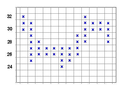
Point and figure charts are among the earliest charts used by traders and date back to the end of the last century. Charles Dow is credited with having first used point and figure charts to record ticker data. Below is a typical point and figure chart.

To make a point and figure chart using one point reversals, only changes of one or more full points are considered. Fractional changes are disregarded. Each point change in the same direction is recorded in the same column, up or down. When the price reverses by one full point from the figure last recorded, move one column to the right and record the change, unless there is only one figure in the column.
Practice making a point and figure chart using the following one-point changes: 30, 32, 25, 28, 26, 27, 26, 27, 24, 27, 26, 29, 28, 32, 30, 31, 30, 31, 28. If you make the chart correctly, it will match the chart above.
Point and figure changes need not be limited to one point. Stocks under 15 may require 1/2 point changes. Two, three or five point changes may be required for expensive or very active stocks. When making point and figure charts using fractional changes or changes of more than one point, simply use the method outlined above. Consider only changes of the selected interval. For example, a three-point chart might consider only these changes: 20, 23, 17, 20, 26, etc.
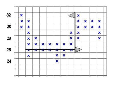
Point and figure charts measure the amount of backing and filling in horizontal trading ranges. On the theory that large moves require more preparation than smaller moves, the point and figure chart is useful as a quantitative tool, often indicating the potential objective of a move up or down. In the next chart, the count of figures at a price of 26 equals 7. Measuring from 26, a count of 7 measures to 32.
Use of point and figure charts appears simple, but successful utilization requires experience. Examples in following chapters will indicate the potential as well as the limitations of this technique.


Join the discussion