Trading is a process that is best carried out in the same way every time otherwise results will be erratic. Just as the croupier in a casino always deals the same way to maintain the odds in favour of the house, the best traders always approach the market the same way in order to maintain their edge.
Here are the steps that I take every day before placing a trade and during:
- Form an opinion about market direction both medium and short-term.
- Check conditions and volatility are suitable.
- Identify a point to enter into a trade.
- Check to see if the market behaviour is confirming the opinion.
- Decide on a target at which to exit the trade.
- Decide at what point to exit if the opinion is wrong.
- Check to see if the reward or upside is significantly greater than the risk.
- Enter the market only when three or more confirmation indicators are in place.
- Exit the market either when the target is hit or if the exit rules are triggered.
Forming an opinion These steps are followed in the same order every trading day and never vary. Lets start with how do we form an opinion? Everybody has an opinion about where the market is heading but the smart trader recognises that these are generally nothing more than subjective hot air.
We need information that has nutritional value and is going to answer 3 vital questions before we can trade and make consistent gains:
- What is it going to take to move the market from where it is now?
- Where is the market most likely going to react back to once the move is underway?
- Where is the market most likely going to end up if the situation changes?
When it comes to reading the market it pays to remember that the price is the only truth. You can not use a chart to predict the future but you can use it to identify areas of support or resistance which we know can halt or reverse a move. These zones are characterised by trading action that is typically within a tight range often referred to as congestion. To form our opinion we start by using a top down approach with four basic candle stick charts and make a note of the price at which these zones of congestion occur.
Chart 1: The longer term outlook which for me is the FTSE 100 Daily Cash index but it could just as easily be the DOW or S&P500.
Chart 2: The Medium term view which is a 60 minute chart of the FTSE quarterly Futures.
Chart 3: The short term view which is a 10 minute candle chart.
Chart 4: The immediate term 3 minute chart which is the one I use to trade live from.
Many people may prefer to trade over longer periods and for them they could use a monthly, weekly, daily and 60 minute. There can be no doubt that more money could be made by leaving open positions in the market over night or over the weekend even but since 9/11 this is something that does not fit my own risk appetite.
A frequently asked question is why do I need to look at the daily chart if I am trading short term? The answer is that we need to understand the sentiment that is driving the market. Very often when you look at a picture too closely you only see the detail and not the image. In much the same way as archaeologists use aerial photographs to identify features on the land that are not visible close up, we need to identify areas of support and resistance which may not be clear on the short term chart.
Now that we have our four charts how do we use them to form an opinion about market direction? Firstly we need to identify which stage the market is currently in.
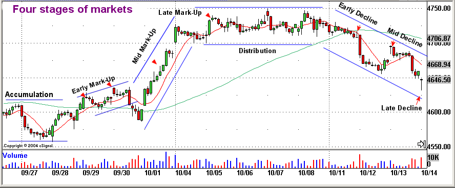
The four stages of markets
Stage 1: Accumulation often marked by sideways congestion.
Stage 2: Mark-up which is a bullish upward trending phase.
Stage 3: Distribution characterised by a sideways market and congestion after a rally.
Stage 4: Decline bearish and downward trending.
The above 60 minute chart taken from FTSE December Futures in October shows typical characteristics of the four stages. Note that in the early accumulation phase the long term Moving Average (MA) shown here in green is almost horizontal. When the price crosses the long term MA to the upside and makes a new high we get our first hint that the market is in early ‘mark-up’. Distribution is marked by the failure to make new highs or lows with the short term MA shown in red being flat and crossed and re-crossed many times. Early decline can be seen when the price range contracts closing consistently below the short term MA and the price crosses to close below the longer term MA. A break of support then flags that stage 4 or Mid decline is well underway. Notice the classically bearish ‘Evening Star’ candle pattern in the centre of the accumulation period as a new high is hit and then rejected. This should be telling us that there is little short-term upside and to get ready for stage 4 or ‘decline’.
We can go one step further with the four stages of the market and divide them into three subcategories. We can ask the question, ‘is the market in early accumulation, mid accumulation or late accumulation?’ The same with mark-up, distribution and decline. Is the market trading in early, mid or late phases? Why should we care what phase the market is in? Good question but as trading is a numbers game we want the odds stacked as much in our favour as possible in much the same way as in our casino analogy. We want to own the same odds as the house and not those of the gambling punter. Therefore if we are wanting to trade long (buying) our target can be that much further up the tree if we are in early ‘mark-up’ as opposed to late ‘mark-up’, which may actually be a turning point. Lets take a closer look at what the basic four stages of the market are and why they occur.
Stage 1 – Accumulation. If we think of a new factory that has just started up producing goods. Shareholders will buy in small quantities if they feel good about the products prospects, but the bulk of the market will stand back waiting to see what will happen. We call this phase early accumulation as optimistic share holders are accumulating stock in the hope that when things take off they will be able to reap the rewards. Lets say that after some initial favourable publicity and published accounts that are ahead of expectations other traders start to take notice of the stock and start buying also. This phase is known as late accumulation and can be marked by increases in volume on the lows of an ordered trading range.
Stage 2 – Mark-up. After a while the share value moves up and breaks out of the restricted trading range. An upward trend has now formed and is confirmed by moving averages on the price chart. We call this phase early Mark-up. As the product becomes established and is very clearly a hit greed starts to take over and now every one wants a piece of the action. Brokers issue upgrades and analysts tip the stock in the financial press, all of which helps to fuel the buying fever. We call this stage Late Mark-up and we can see that with all the interest in the stock Volume has increased noticeably on our price charts especially in this closing phases of price escalation.
Stage 3 – Distribution. However the original investors are now feeling that it is time to start taking profits and cash in on their wise investments. They start by selling the shares in small quantities. The stock is still popular but the product is no longer a hot item. On our price chart we can now see the price moving sideways as the buyers become exhausted and the supply of shares is greater than the demand for them. We call this phase Distribution as the shares are now being distributed to anyone who wants them at the mature market price and there are no shortages.
Stage 4 – Decline. Perhaps some disappointing news will trigger this such as earnings being less than the rapid growth rate investors had become used to. There may be increased competition as other companies spot the gap in the market and move in to cash in on the profits of this overlooked sector. Shareholders start selling the stock and the price breaks support on our price chart. This stage is known as early decline. Mid decline set’s in when all those shareholders who bought on the advice of the gurus and analysts start to realise that this stock is not going to recover in the short term. Panic sets in causing the share value to fall further. There is a shortage of buyers at these prices and this is causing an acceleration in the rate of fall. At first the volume is quite thin as fear spreads and media sentiment becomes negative with very few people left who want to hold this stock. As the new lows are hit you can often see volume increase as new buyers re-enter the market recognising a bargain when they see one. The share value is at saturation and the volume of trades is merely confirming that both buyers and sellers are in agreement about the value.
The Cycle starts again. After a while the factory produces a new range of products and the whole sequence starts over again and we are back at accumulation as shareholders buy into the new product and accumulate shares at the low price in anticipation of future profits. On our price chart we can see that we have returned to ordered trading and that the stock has found it’s fair value and is now once again trading sideways within a range.
Does any of this sound familiar? It should, as everything in life has a cyclic nature and it is having an understanding of what phase we are in the cycle that is going to allow us to trade most profitably. We can use simple moving averages to assist us with this. We will talk about how we do this in the next lesson but for now it is important to understand the basic concept. Having determined what phase we are in we can then look very carefully at the candle patterns which form at the top of any rally or the bottom of any sell off. Candles can be a powerful indicator of sentiment and can tell us who is in control of the market. When used with the medium term or short term charts and an understanding of the price volume relationship they can provide unequivocal confirmation of pending moves.
We will look at some working examples of how we can identify the four stages of the market in the next lesson as well as discussing how we use this information combined with candle, volume and overbought/oversold indicators to trade. When all of the lessons have been completed you should be able to follow a straightforward decision making process and be able to spot the turning points in the market in advance of putting on low risk, high probability trades. You will know exactly where to place your stops and exactly when to exit.
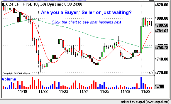
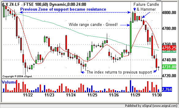
Were you a seller? Above the index did smash through the ceiling of previous resistance at 4770 on the morning of 29th Nov 2004. On the surface this looks quite bullish. Volume is high as the trading herd surge to try and jump in on the break out, whilst the smart money expecting 4800 to act as resistance start scaling in to short (sell) positions as the new resistance is approached. As in the past congestion at 4800 calls a halt to the move. There is a short period of distribution before decline sets in. Chartists could have easily mistaken the wedge at the top of the move for a pennant, (a well known continuation indicator), but these patterns are unreliable. At 4800 a red ‘Failure Candle’ formed and was confirmed by an ‘Inverted Hammer’ three bars later. The cause is traders distributing contracts at a point of under demand and oversupply. Selling pressure finally forces red reversal candles to close near the bottom of their range and sentiment turns Bearish. The green long term Moving Average continues it’s downward slope unchanged. Were 4760 & 4730 your short side target? When the sell-off starts notice how the index pauses at previous resistance of 4770. There is a false rally as the weak holders of stock are cleared before the down move is completed and support found once again at 4730.
This may not be the end of the story as as when support or resistance is re-tested very often the third time can be a break out.


